Maternal Health Is More Than a Moment — What the Data Reveals Across the Full Spectrum of Care
When we think about maternal health, we tend to focus on a narrow window — the pregnancy itself, the delivery, and the immediate postpartum period. But the data tells a different story! The conditions that shape maternal and child health outcomes start long before conception and extend well beyond a new birth certificate.
In a recent episode of our Data Chats podcast, Metopio's data team explored the full spectrum of maternal and child health through a series of maps and indicators — from hospital access and breastfeeding rates to a custom Maternal Hardship Index that captures what it actually means to navigate pregnancy and early parenthood in America today. Here's what the data revealed.
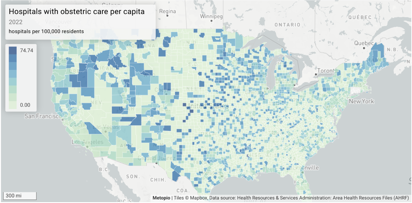
Where You Deliver Matters
The first map our team pulled up showed hospitals with obstetric care per capita. It's a foundational layer of maternal health access — and the disparities are stark.
Large swaths of the country, particularly in the rural West and Great Plains, show counties where obstetric care is hundreds of miles away (like certain counties in Montana, North Dakota, and South Dakota). In these areas, the question isn't which hospital to deliver at — it's whether you can get to one at all before or during labor.
This is the geography of what researchers call maternal care deserts: places where the absence of care isn't a policy gap to be closed, but a physical reality measured in hours of driving.
Breastfeeding Initiation: A Canary in the Coal Mine
Breastfeeding initiation rates might seem like a narrow indicator, but when Metopio's data team analyzed which community health indicators most consistently predicted poor downstream outcomes — things like cancer rates and diabetes prevalence — breastfeeding initiation showed up again and again as one of the strongest signals.
This is likely because it's rarely about breastfeeding alone. As Heather Blonsky, VP of Data at Metopio, explained: "It's almost the canary in the coal mine. Are people engaging in health-related behaviors? Are they getting prenatal care and advice? Do they have the time to care for their newborn, or are they going right back to work?"
Low breastfeeding initiation rates are often a proxy for a cluster of compounding pressures — lack of employer support, inadequate parental leave, limited access to lactation resources, and social networks that are themselves under strain. The map doesn't show a breastfeeding problem, it shows a support system problem.
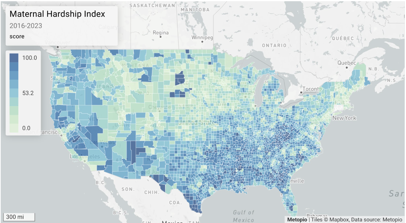
The Maternal Hardship Index: Measuring What Actually Matters
Access to obstetric care and breastfeeding rates are useful — but neither alone captures the full picture. That's why Metopio built a custom Maternal Hardship Index, an indicator that spans the entire arc of maternal experience: pre-pregnancy health, prenatal access, delivery care, and postpartum support, including access to affordable childcare.
The result looks different from the individual indicators that went into it — and that difference is the whole point.
"The health of the mother going into the pregnancy matters at least as much as prenatal care," Blonsky noted during the episode. "When that isn't taken care of — when moms can't keep their own health up, or when there are higher rates of uninsurance — they go into the pregnancy in worse condition and come out in worse condition."
The index also surfaces patterns that individual indicators miss — including the particular hardship concentrated in Native American reservation communities, particularly visible in the Plains states and the Navajo Nation in Arizona. These are communities where the experience of maternal health is shaped by a distinct history of systemic underinvestment that deserves its own analysis.
Why Sub-County Data Changes Everything
National and county-level maps are useful for identifying regions of concern. But some of the most important stories in maternal health are hyperlocal — and they disappear when you zoom out too far.
When our team applied the Maternal Hardship Index at the sub-county level, the disparities became even more pronounced. A Cook County, Illinois map reveals stark differences between the South Side of Chicago, the West Side, and the suburbs — communities that would be averaged together in a county-level view.
The same pattern appears in Texas cities: maternal hardship looks manageable at the metro level, but zooming into specific neighborhoods reveals sharp divides that the county number simply can't see.
"We can't just say Cook County," Blonsky emphasized. "Within that — especially in an urban county — you have so many variations that the Census tract matters, the zip code matters, the neighborhood matters."
When Every Map Looks the Same — and What to Do About It
One challenge that comes up repeatedly in community health data work: after a while, the maps start to look alike. Maternal mortality, food insecurity, uninsurance rates, fetal mortality — the same counties light up, the same regions struggle.
That's not a coincidence, but it also doesn't mean all indicators are interchangeable. The real analytical work is finding the variable that adds something — the one that shows where poverty alone doesn't explain the outcome, or where an intervention may have already moved the needle. Is it distance to a grocery store, or travel time by bus? Is it the uninsured rate, or maternal morbidity as a leading indicator for mortality?
These distinctions matter because they point toward action. You can't wait for everything to have already gone wrong. The value of a rich indicator set is the ability to identify where intervention could go before outcomes deteriorate further.
What This Means for Your Community Health Planning
Maternal and child health data is most powerful when it's treated as a spectrum — not a snapshot of the delivery room, but a continuous picture of conditions before, during, and after pregnancy. For community health departments and hospital teams building Community Health Assessments and CHIPs, that means:
Looking beyond clinical access indicators to include pre-pregnancy health, insurance coverage, employment, and social support
Using sub-county data to identify neighborhood-level disparities that county averages hide
Treating indicators (like breastfeeding initiation) as proxies for broader support system gaps, not just clinical behaviors
Building or customizing composite indices that reflect a community's specific context — not just using off-the-shelf metrics
Identifying leading indicators (like morbidity and uninsurance rates) that allow for intervention before maternal mortality data can even detect a trend
The bottom line: Maternal health disparities don't start at the hospital. They start years earlier, in the conditions that shape whether a pregnancy begins from a position of stability or strain. The data can show you where — if you're looking at the right level of geography, with the right combination of indicators.
Get Started Today
Explore maternal and child health data for your community in Metopio's platform, including the Maternal Hardship Index and sub-county indicators. Schedule a demo to see how.