What the New ACS Data Reveals About Your Community (And How to Use It Right Away)
The newest American Community Survey data dropped in late January — and within nine hours, Metopio's data team had it curated, analyzed, and ready to explore. A few days later, we hosted a 30-minute interactive webinar to break down what the this release reveals about your community and how to put it to work immediately.
If you missed it (or want to revisit what we covered), here's your recap.
Moving Beyond the COVID Years
This release marks a turning point. We're finally getting out of the peak COVID years — 2020 and 2021 — when everything was constantly changing. This ACS data gives us a clearer picture of what's become the "new normal" and what's still shifting.
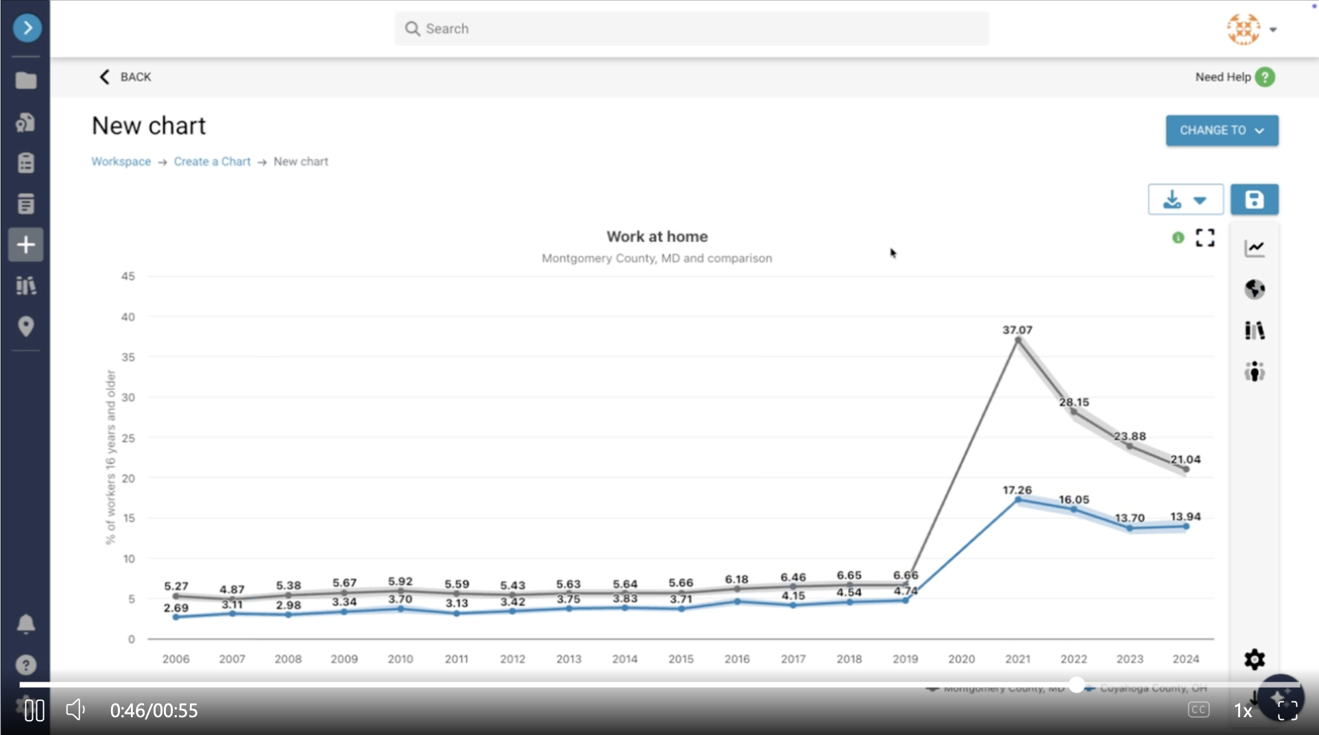
Work from Home: Regional Patterns Emerge
One of the clearest examples of post-pandemic shifts is “work from home” rates.
We compared Cuyahoga County, Ohio (home to Cleveland) and Montgomery County, Maryland (just outside D.C.). Both saw massive spikes in remote work during 2021, but their trajectories diverged:
Cuyahoga County has plateaued. From 2023 to 2024, there's almost no change.
Montgomery County is still seeing ongoing shifts, potentially driven by policy changes in federal and professional sectors.
This difference may be due to industry composition. Montgomery County has a high concentration of public administration and professional services — jobs that can work remotely. Cuyahoga County has a large healthcare workforce (Cleveland Clinic and other hospital systems), where remote work simply isn't an option. Explore work from home data for your county here.
How Local Data Fills in the Gaps Around SNAP Benefits and Food Insecurity
With federal data sources becoming less reliable, local survey data is more critical than ever.
We explored SNAP benefit data from the ACS alongside food insecurity data from the Chicago Healthy Chicago Survey, displayed on the Chicago Health Atlas (powered by Metopio). The patterns? Nearly identical.
This shows that even as some federal data sources disappear or change, SNAP benefits remain a strong leading indicator for food insecurity. And when you layer in local survey data, you get an even richer, more actionable picture.
Young Invincibles: Healthcare Coverage Gaps
We focused on the 19-25 age group, often called "Young Invincibles" because they're young, healthy, and frequently uninsured.
The data shows:
Males in this age group have higher rates of no healthcare coverage compared to females, across almost every geography.
The gap is especially pronounced in rural areas.
This is as upstream as it gets for adults. Young people without insurance today may develop chronic conditions that go unmanaged, leading to complications down the road. Addressing coverage gaps now prevents bigger health issues later. Explore Young Invincible healthcare coverage data here.
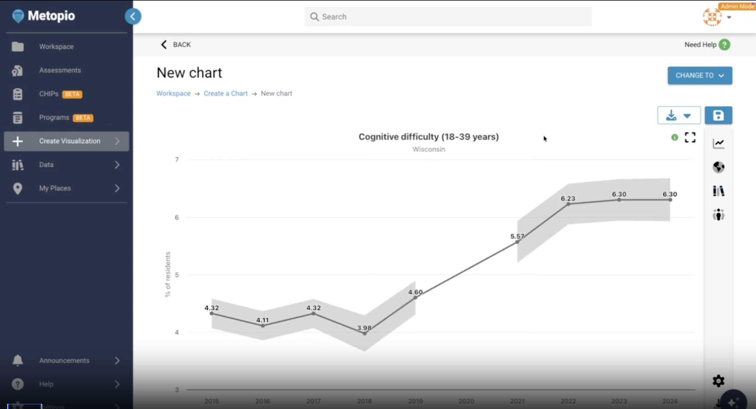
The Unexpected Pattern of Disability in Young Adults
One of the most surprising findings from this round of ACS data is that self-reported disability rates among 18-39-year-olds are rising — and in some rural areas, they're actually exceeding rates for adults 65+.
This is especially true for:
Cognitive disability
Independent living difficulty
We don't have a solid explanation yet. It could be long COVID, or mental health crises manifesting as disability. But the pattern is clear, and it's one that requires local context to understand. Explore disability data for your region here.
The Hardship Index: Seeing the Big Picture
Sometimes it's not just one issue, it's how everything piles on together.
The Hardship Index (built with Metopio's Index Builder) combines unemployment, poverty, housing burden, and other economic factors into a single measure. It helps you identify neighborhoods where everything is going wrong, and where resources have been under-supported for years.
We looked at North Dakota, comparing the state overall, rural counties, and Burleigh County (home to Bismarck). The differences were striking, showing how economic hardship concentrates in specific places even within a largely rural state. Explore the Hardship Index here.
Bonus tip for Metopio users: when ACS data updates, indices built on ACS data automatically recalculate. You don't have to rebuild from scratch!
What You Can Do With This Data
The 2024 ACS release isn't just numbers, it's the foundation for your Community Health Assessments, improvement plans, grant applications, and future strategic planning. Here's how teams are using it:
Layering ACS data with local survey data to fill gaps left by disappearing federal sources
Stratifying data by age, sex, and geography to identify specific subpopulations at risk
Building custom indices to track cumulative hardship and prioritize resources
Comparing rural areas to rural benchmarks (not national averages) for fair assessments
Uploading their own data (claims, surveillance, surveys) and combining it with ACS indicators for richer insights
Want to Explore More?
We covered this post and our 30-minute webinar, but there are hundreds of ACS indicators in Metopio, and we couldn't get to them all!
That’s why we launched Data Chats, a Metopio podcast where we talk about turning community data into real-world action. Each episode explores how leaders across public health, hospitals, and policy can use data to understand their communities, shape priorities, and drive change.
Click here to subscribe to our Data Chats Podcast and get future episodes delivered straight to your inbox!
What's Next
If you’re ready to see how Metopio can help you work with the new ACS data and future data releases, schedule a demo to explore how we automate CHAs, CHIPs, and community health planning — turning months of work into minutes.